Responsive websites face the issue that an advert which looks fabulous full screen on a desktop can end up being unreadable and out of proportion once scaled down to a mobile screen size. One way to overcome this is to break out your individual slides into sections, as the design scales down you can manipulate the layout to ensure the layout utilises the space effectively throughout each of your various breakpoints. I’m going to break down an example but it’s worth mentioning that as long as you get the initial proportions/ aspect ratio right there’s really no limits to what you can achieve.
My slider plugin of choice is jQuery cycle 2 by Mike Alsup, it offers a stable foundation which also gives the versatility needed to extend easily.
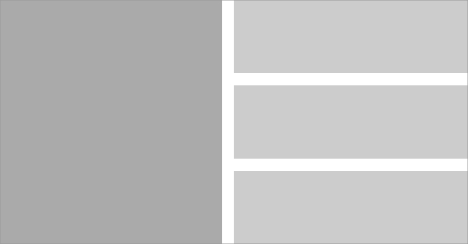
First things first you need to be able to fit the sections into your given size like a jigsaw puzzle. If you start out in Photoshop with a blank canvas of the placeholder size you will be able to experiment with different layouts before committing to code. In this super simple example I have a placeholder size of 960px x 500px which is broken up into a main left hand section and three equal height/spaced right hand side sections.

At the breakpoint of 480px (iPhone portrait) i’m going to stack the four sections on top of each other.

As you will be able to see from the demo the layout scales fluidly in-between, creating a responsive billboard solution which doesn’t become too small that text becomes illegible. (change your browsers viewport width to see how the layout scales)
From your photoshop composition you will need to convert your layout into %. To do this you divide your section size by it’s container size and then times that figure by 100 to get your % value.
(target / context) x 100 = result %
So to put this formula into practice for my example:
- To get the left hand side container I divided 455 (the width of the left hand side) / 960 (the width of the parent container) to get 0.4739583333333333, I then had to times this figure by 100 to get the container width of 47.39583333333333%. In addition I added a 25px margin right property by dividing 25/960 and then multiplying it by 100 – 2.604166666666667%.
- For the right hand side column I divided the width 480px / 960px * 100 which gave me 50% (I know this was a lot easier to work out as it’s half the value but I’m trying to be as specific as possible)
- In addition I had to add a margin bottom to the right hand side images which matched 25px center gutter. As the parent container had a height of 500px I divided 25/500 * 100 which gave 5%. I added a class of ‘last’ to remove the bottom margin from the last image.
- Within the media query for my 480px breakpoint I simply set the width for the right and left hand containers to auto and cleared the margin right & float.
- To even out the layout I added a margin bottom property to the left hand side container that matches the margin bottom of the images within the right hand side.
This as mentioned is a super simple example. I have built websites such as www.bristolstreet.co.uk which demonstrates more breakpoints / complex layout, I just wanted to share the theory and I’m sure you will be able to apply it into great practice.