I’ve been a web developer long enough to (shamelessly) remember the days of table based layouts, granted I think I may have only cluttered the web with one site but back in the day before web standards it was kind of accepted practice…..
Obviously I quickly moved into CSS based layouts and had enormous amounts of fun, along with quite a bit of frustration when experimenting with floats and fixed/ absolute positioning. The awesome sites that people have been able to produce is true testament to the power of CSS and what can be achieved, especially whilst thinking outside the box however I don’t think any web developer would disagree when I say that these techniques are still problematic and we need hacks and fixes in place to ensure they work for layout. Even something as simple as a equal height columns such as a sidebar/ main content area require extra work to achieve the desired results. (these properties weren’t designed for the task in hand, so inevitabley relied on hacks).
The introduction of the CSS Flexible Box Layout Module (Flexbox) aims to make the shortcomings mentioned above a thing of the past. The websites I work on need to support IE so I haven’t adopted it with quite as much readiness as other CSS3 features, it is worthwhile mentioning the majority of browsers do widely support it (http://caniuse.com/#feat=flexbox).
Flexbox allows us to manipulate elements in a wide variety of ways, we can lay elements out on our page in any direction and even change the order they’re viewed without having to amend the HTML, this is a very powerful feature in our responsive projects because a lot of the time when we shrink our designs down to mobile size we do often need to reposition core call to actions to feature higher in the page priority. Historically we have had to float sidebars in a strategic way to ensure that users won’t have to scroll down a whole page past a lot of (main) content to see the call to action which often reside in the secondary (sidebar) panel.
Flexbox also allows us to grow, shrink and auto-fill space; equal height columns and vertical alignment hacks really will be a thing of the past.
The Flexbox model comprises of a Flex Container, and it’s retrospective Flex Items. As soon as you define a container to be a Flex Container, all direct child elements of that parent element naturally become Flex Items. These Flex Items fill up the Flex Container and create Flex Lines (by default these lines have a direction of left to right, top to bottom, it might be easier to think of them as rows). There is no limit to the number of Flex lines you can have, once there are enough Flex Items to fill up the space of the first Flex Line, the items go onto the next Flex Line and fill up the row to make a third and so on.
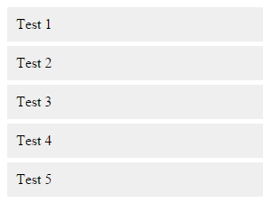
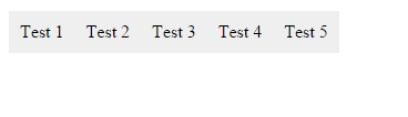
To create a Flex Container you need to define the parent container with the CSS property { display:flex; }. So, if you had an un-ordered list say for instance representing your sites navigation, by default the <li> elements would stack on top of one another, once you added the { display:flex; } value to the parent container all of the <li>’s would become traditionally inline elements and become arranged side by side, left to right.
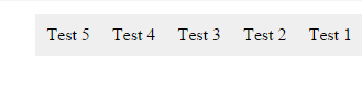
It is then very easy to manipulate the Flex Items, such as change their direction, if we added the property ‘flex-direction’ to our parent UL, we could define values ‘column’, to display the items in a vertical direction, or ‘row-reverse’ to reverse the direction fully as demonstrated below.
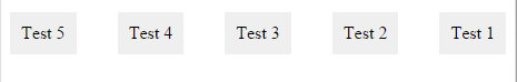
The real power of Flex Box comes in its more advanced properties. If you want to evenly distribute content across a row all you need to do is add the value ‘space-between; to the ‘justify-content’ property.

When you begin to add the code to distribute and justify Flex Items, the Flex Container doesn’t drop overflowing items onto the next line, however by simply adding the property ‘flex-wrap’ to the Flex Container with a value of ‘flex’, we are able to create a multi-line container again.